

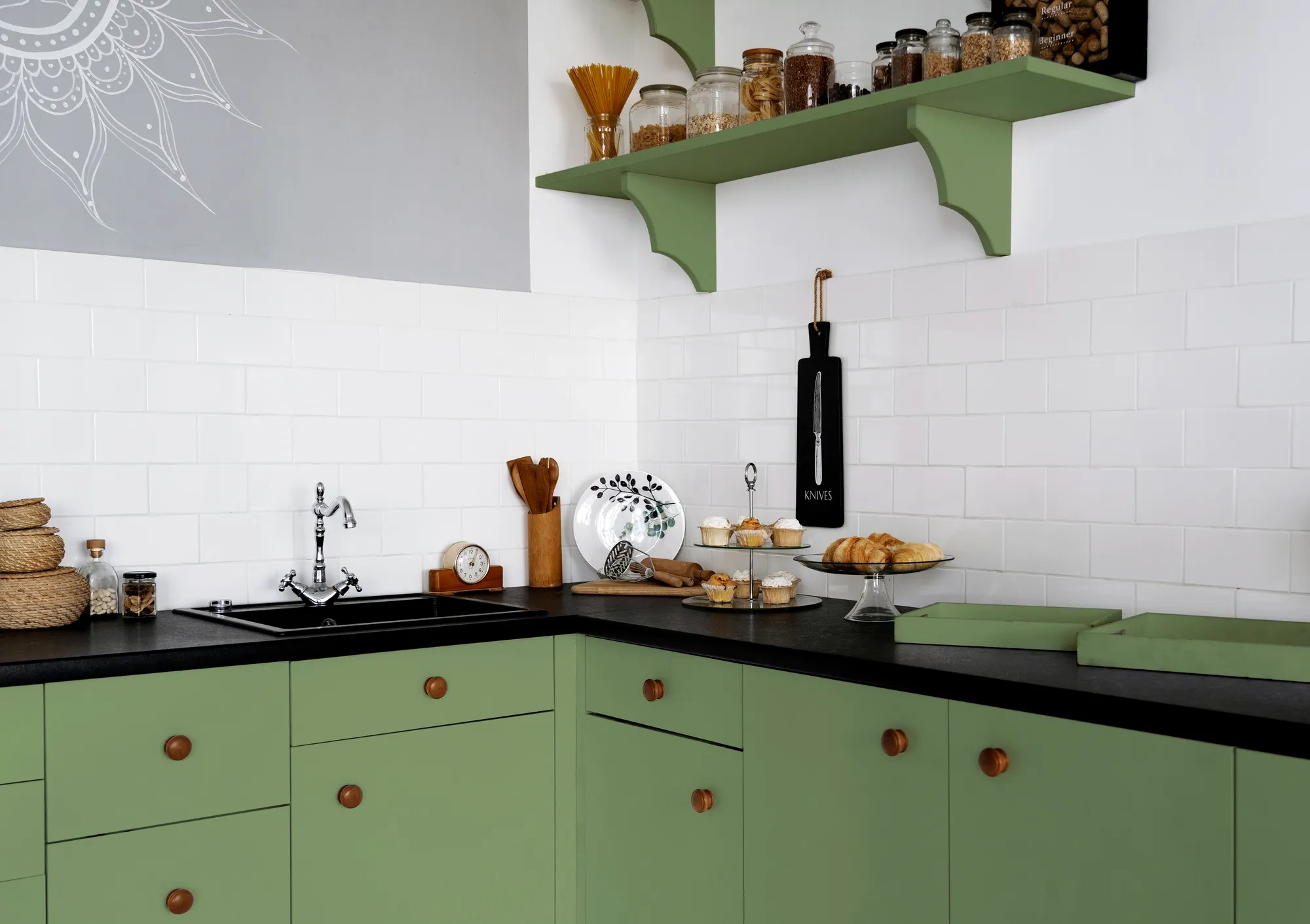
Colour is one of the most important decisions in any kitchen design. It influences mood, space perception, and how well different elements in the room work together. When it comes to kitchen splashbacks, choosing the right colour combination can completely transform the look and feel of the space.
In modern UK homes, homeowners are increasingly using glass kitchen splashbacks to introduce colour in a controlled, stylish, and low-maintenance way. Because glass can be custom coloured, it opens up a wide range of design possibilities that go far beyond traditional tiles.
Many homeowners explore tailored options from suppliers of kitchen splashbacks to achieve coordinated colour schemes that match cabinets, worktops, and flooring.
Why Colour Combinations Matter in Kitchen Design
A kitchen is made up of multiple visual elements working together. Cabinets, worktops, flooring, and walls all contribute to the overall design.
The splashback sits in a central visual position, meaning its colour can either unify the space or create contrast.
Good colour combinations help:
- Create visual balance
- Improve lighting and space perception
- Enhance modern or traditional styles
- Add personality without overwhelming the room
Poor combinations, on the other hand, can make a kitchen feel cluttered or mismatched.
Classic White and Grey Combinations
One of the most popular choices in UK kitchens is the combination of white and grey.
Why it works:
- Clean and timeless appearance
- Works with both modern and traditional kitchens
- Easy to match with most cabinet styles
Common pairings:
- White cabinets with light grey splashbacks
- Grey cabinets with white glass splashbacks
- White quartz worktops with soft grey accents
This combination is ideal for homeowners who want a neutral, elegant kitchen design.
Black and White Contrast Designs
Black and white is a strong, high-contrast combination that creates a bold modern look.
Why it works:
- Strong visual impact
- Clean and structured appearance
- Suitable for minimalist and contemporary kitchens
Examples:
- White cabinets with black glass splashbacks
- Black cabinets with white reflective splashbacks
- Monochrome kitchens with alternating tones
This combination is particularly effective in modern urban homes and open-plan spaces.
Neutral Beige and Cream Tones
Warm neutral tones are ideal for creating a soft and welcoming kitchen environment.
Why it works:
- Adds warmth without overpowering the space
- Creates a natural and calm atmosphere
- Works well with wood finishes
Common combinations:
- Cream cabinets with beige splashbacks
- Soft brown worktops with neutral glass panels
- Light wood kitchens with warm-toned splashbacks
This is a popular choice for family kitchens and traditional-style homes.
Blue Kitchen Splashback Combinations
Blue is one of the most popular colour choices for glass kitchen splashbacks in modern UK design.
Why it works:
- Adds colour without being too overpowering
- Works well with both light and dark cabinetry
- Creates a fresh, modern feel
Popular pairings:
- Navy blue splashbacks with white cabinets
- Light blue glass with grey worktops
- Deep blue splashbacks with wood finishes
Blue works especially well in coastal-inspired or contemporary kitchens.
Green Kitchen Colour Schemes
Green has become increasingly popular in modern interior design due to its natural and calming effect.
Why it works:
- Connects kitchen design with natural elements
- Works well with wood and stone textures
- Offers both bold and soft variations
Examples:
- Sage green splashbacks with white cabinets
- Dark green glass with brass or gold accents
- Olive tones paired with natural wood kitchens
Green combinations are ideal for creating a balanced and organic kitchen feel.
Bold Red and Statement Colours
For homeowners who want a more expressive kitchen design, bold colours like red can create strong focal points.
Why it works:
- Creates energy and visual impact
- Works well in feature areas
- Adds personality to neutral kitchens
Best uses:
- Red splashbacks behind cooking zones
- Accent panels in otherwise neutral kitchens
- Combined with white or black cabinetry for balance
Bold colours should be used carefully to avoid overwhelming the space.
Metallic and Reflective Colour Schemes
Metallic finishes are increasingly used in modern UK kitchens to create a premium look.
Why it works:
- Adds depth and luxury
- Reflects light effectively
- Works well with modern appliances
Popular options:
- Silver glass splashbacks with grey kitchens
- Bronze tones with dark cabinetry
- Gold accents paired with neutral interiors
These combinations are often used in high-end kitchen designs.
Matching Splashbacks with Worktops
A successful colour scheme must always consider the worktop.
Key guidelines:
- Patterned worktops pair best with simple splashbacks
- Solid worktops allow for bolder splashback colours
- Neutral worktops offer the most flexibility
For example, a marble-effect worktop pairs well with soft grey or white glass splashbacks to avoid visual overload.
Light vs Dark Colour Balance
Balancing light and dark tones is essential for a well-designed kitchen.
Light dominant kitchens:
- Feel more spacious and airy
- Benefit from darker splashback accents
Dark dominant kitchens:
- Feel more dramatic and modern
- Benefit from lighter or reflective splashbacks
Glass splashbacks are especially useful because they can balance both extremes through colour and reflection.
Gloss Finish and Colour Perception
Finish type can change how a colour appears.
Gloss glass:
- Makes colours appear brighter
- Enhances reflection and depth
- Ideal for modern kitchens
Matte glass:
- Softens colour intensity
- Reduces glare
- Creates a more subtle appearance
Choosing the right finish ensures the colour behaves correctly in your space.
Common Colour Mistakes to Avoid
Some common mistakes include:
- Using too many competing colours
- Ignoring natural lighting conditions
- Choosing bold splashbacks with busy worktops
- Not testing samples in real kitchen lighting
- Overmatching every element too closely
Avoiding these mistakes helps create a more balanced design.
The Flexibility of Glass Kitchen Splashbacks
One of the biggest advantages of glass splashbacks is full colour flexibility. They can be:
- Custom colour matched to cabinets
- Designed in bold or subtle tones
- Finished in gloss or matte styles
- Created as feature panels or full-wall designs
This makes them suitable for almost any kitchen style in the UK.
The Role of Online Suppliers
Modern homeowners often prefer online ordering for kitchen design projects due to convenience and customisation options.
Companies such as Direct Splashbacks provide made-to-measure kitchen splashbacks designed for a wide range of colour schemes and layouts.
Business Details:
Direct Splashbacks
St. Andrews Business Centre
Mold, Flintshire
North Wales, CH7 1XB
Contact us: [email protected]
Monday – Friday: 9am – 4pm
(Office only — no showroom. Online business only.)
Final Thoughts
Choosing the right colour combination for kitchen splashbacks is essential for creating a balanced, stylish, and functional kitchen. Whether using neutral tones, bold contrasts, or metallic finishes, the right pairing can completely transform the space.
With the flexibility of glass kitchen splashbacks, homeowners can achieve precise colour matching and modern design consistency, making them one of the most versatile choices in UK kitchen interiors.